
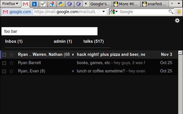
more_minimalist_gmail.css is a userstyle that hides most of Google Gmail’s UI, leaving simplified view of your email, labels, and search box. It’s intended for people who primarily use Gmail via the keyboard.
It was inspired by Matt Constantine‘s Minimalist Gmail browser extension, which I used for a while and liked. It’s out of date, though, and the userstyle goes further, hides more, and since it’s a userstyle, is much simpler.
More Minimalist Gmail also has its own page on userstyles.org.
Tips:
- Use keyboard shortcuts! This userstyle expects that you do; it’s pretty much unusable otherwise. Details here. (There are a few undocumented ones too, including – in the new UI – Ctrl-Shift-T/C/B to jump to the To, CC, ex BCC boxes.)
- If you’re using Stylish, you can temporarily show the hidden features by turning off Stylish. Click the Stylish icon and select Turn all styles off. When you’re done, select Turn all styles on. Bonus tip: if you do this often, add a keyboard shortcut with keyconfig.
- You can hide individual labels in the GMail settings Labels tab. This includes built in labels like Starred, Important, Chats, Circles, etc.
Hello,
Something weird happens here.
My gmail doesn’t look like this at all.
It is all messed up.
Browser: Chrome
Extension used for userstyle: Stylish
Gmail theme: Light
Is this style compatible with the new gmail that launched a few days ago?
@AAS, sorry, you’re right, it is broken in chrome. i use firefox, and i hadn’t tested in chrome before now. i’ll take a look and fix it in a day or two.
fixed! there were some chrome-specific bugs, and gmail also changed a bunch of their classes a few days ago, after launching the new look. i think they locked them down to more permanent class names, which hopefully means fewer breakages for us in the future.
in any case, i’ve released a new version on userstyles.org that fixes both problems. thanks again for the report!
Your update on 11/14 made it impossible to use the “move to” feature using the usual hot key, control + V. Otherwise, it’s almost perfect in both Firefox and Chrome.
Just played around editing the style. I found I brought back the “Move to” capability using the hot key V, by deleting:
/* List view /
div.G-atb.D.E, / header and footer buttons (also applies to conv view) /
td.apU > span, / per thread stars */
One more thing: I need the ability to print email using the button upper right of email, so I deleted this and it came back:
span.hk.J-J5-Ji,
That worked in Firefox, but not Chrome for some reason.
thanks for the detailed report! i’ve fixed the menus bug, brought back the print and new window buttons, tested in firefox and chrome, and posted a new version here and on userstyles.org.
happy emailing!
Thanks for the hat tip, Ryan. For some reason, I still don’t see the Reply and More buttons to the right of the email time. I need the More button to print email without printing everything on the page. Print, as you know, is one of the options under More.
Ryan, I found it. Here’s what needs to be dropped in both Firefox and Chrome to enable the Reply and More buttons:
td.acX, /* top right reply and drop-down arrows */
Now the style is absolutely perfect! We should be working for Google. How can you improve on perfection? Easy.
sure, displaying the More menu sounds reasonable. done.
Now it is perfect. Thank you.
Found one more little bug: The style does not install in Google Chrome’s Canary version. Stable version works fine, but not Canary. I suspect you don’t care much about that, and I don’t either. When I install it as a user style, it works fine, and that’s what I’ve done. But installing with Stylish does not install in Canary. Probably not worth your time to figure out why since the Canary version changes every few days. But I thought you’d want to at least know about it.
BTW, the Stylish installation works perfectly in both the stable Firefox 8 and the cutting-edge Nightly version, Firefox 11. Funny how thing seem to always work in Firefox as long as you have plenty of RAM to handle it. Maybe it’s because they’ve been at it longer and not trying to do too many things at once—until, perhaps, recently. But competition is good for all. But I digress. Sorry.
Hi, Great looking style, really like it – one quick thing – can you tell me what modification I might make to bring back the stars? They are one of the few things I miss… :s
sure! pretty much everything is commented, so you just need to remove the two lines that mention stars. in the current version, that’s lines 106 and 116.
On 2/15, the Gmail logo and the blue Search button mysteriously reappeared in the Gmail window using this Style. One of the problems is that when you try to send an email to a lable, using control + V, the box that appears with the labels is right over the Gmail logo (not very pretty).
The code of the Style, Gmail More Minimalist, still indicates the logo and the search button should be hidden, but that hasn’t happened for the past ten days.
The Style is still far better than all the other minimalist styles and add-ons available for either Firefox or Chrome.
Thanks for listening.
John Marshall
thanks for the nudge and kind words, john! i work for google, so i saw these changes a while ago in my internal gmail account, but i hadn’t published my updates yet. i’ve pushed out that new version now.
Excellent! Works perfect once again. Thank you.
JM
Ryan, now that you’ve outed yourself, a question. Any chance you could pass along to your employer how many of us out here loved the Compact Navigation flag and miss it? Was working great, looking good, but then disappeared with no public explanation. It fit right in with Chrome’s simple, clean look. You see the nav bar only when you need it. Firefox has a great add-on that does this well, Hide Navigation Bar. Wish there were something like that for Chrome at least as an add-on. Cnav was the best and is missed. I’ve been looking high and low for it for a couple months now.
Again, thanks for listening.
JM
heh, sure. i don’t use chrome, so i’m not familiar with compact navigation, but i’ll ask around.
Thanks for this! I used More Minimalist Gmail to create an email-archive-only version of Gmail, i.e. one that does not distract me with new incoming email when I am trying to find an old message. Just added the following styles:
.zE { display: none } /* hides every message that is unread /
.n1 .n0 { display: none } / hides every label that has unread messages. It is still clickable though */
A weird use case, I know. I just feel that where I archive my information should not be the same place where my new information comes in and distracts me (I use a different client to deal with incoming email). Glad that MoreMinimalistGmail could support this so easily in Chrome!